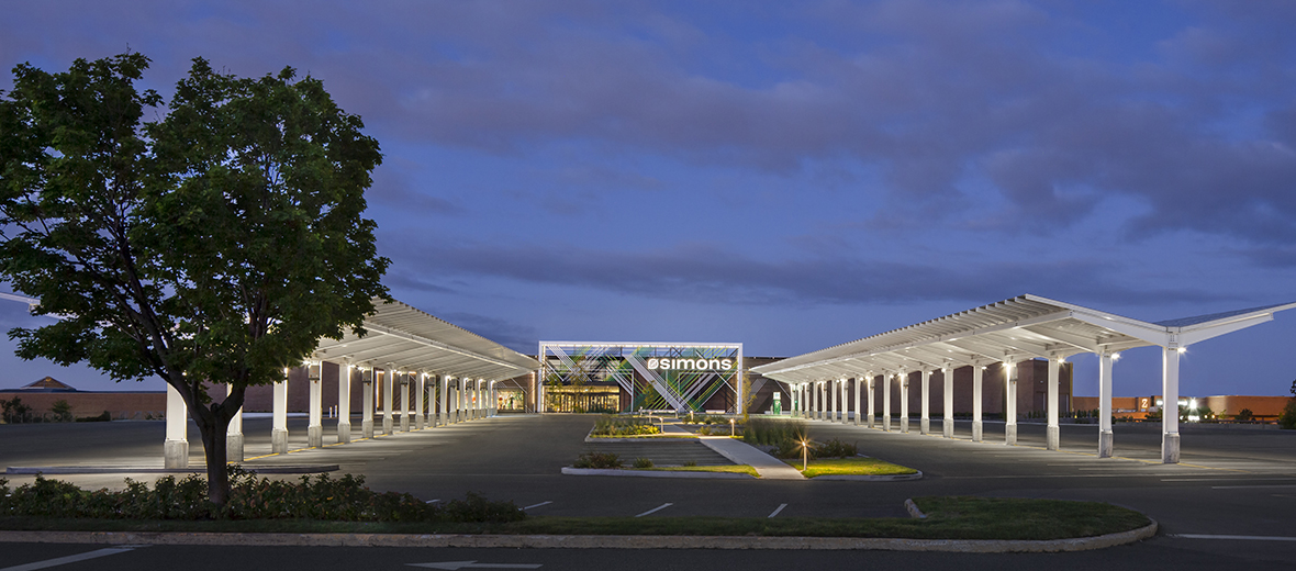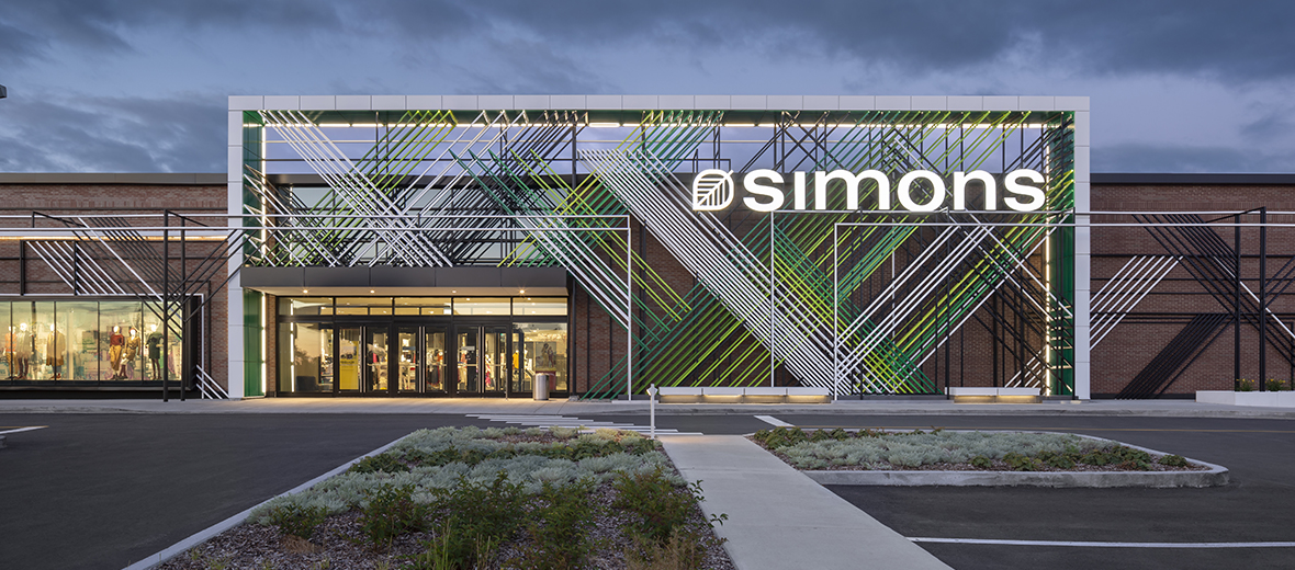
La Maison Simons Galeries de la Capitale
Québec City
2018
80000 sq. ft.
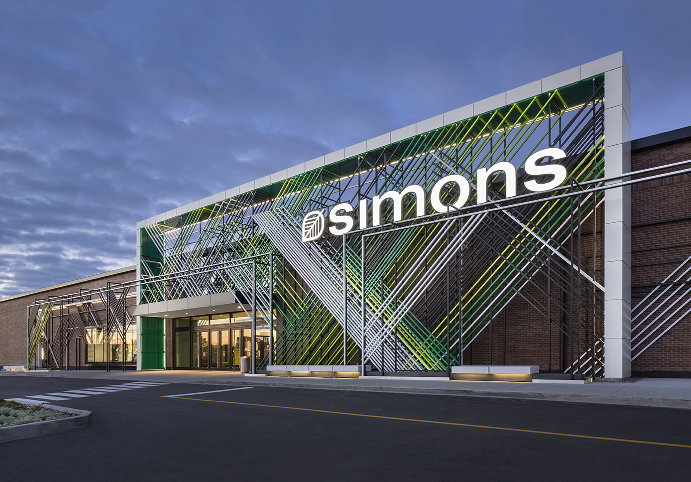
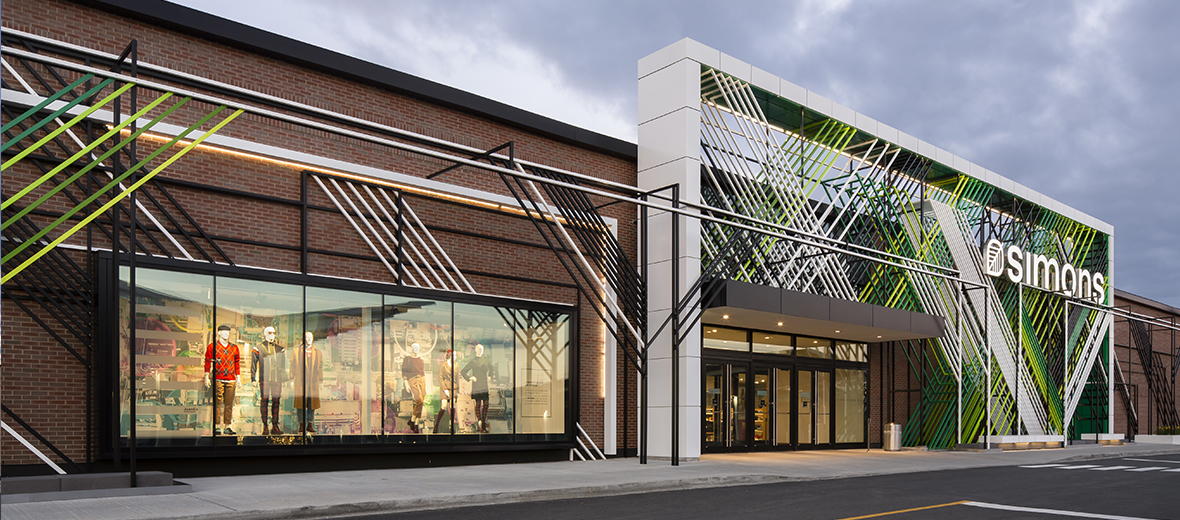
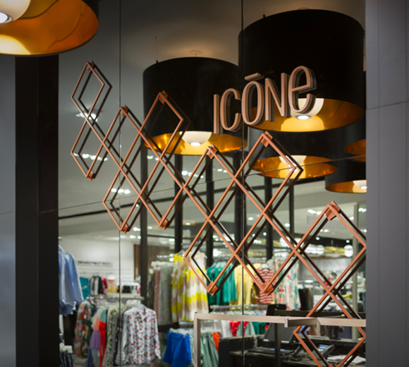
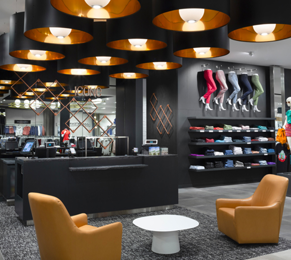
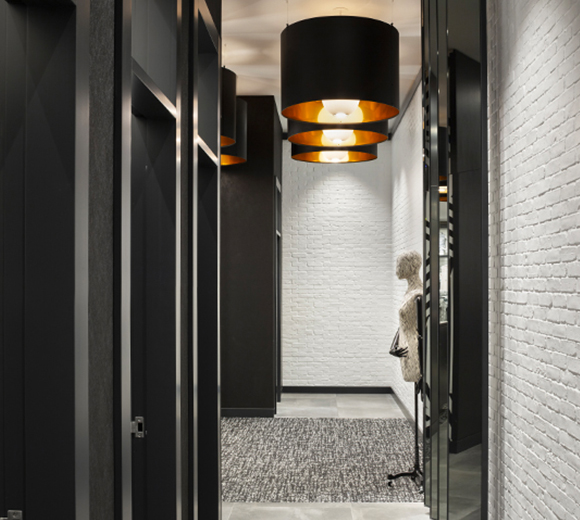
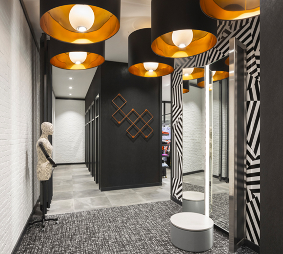
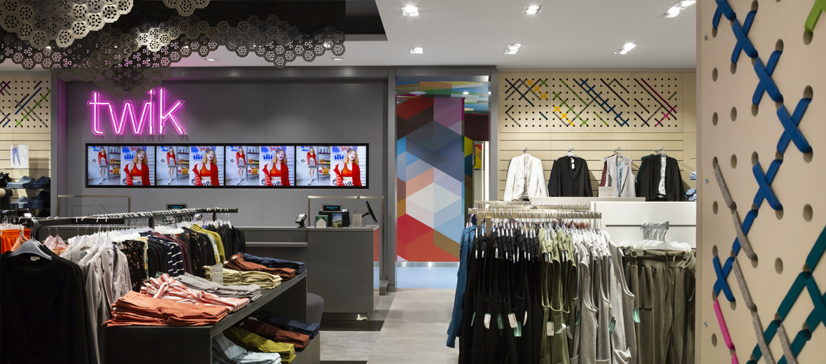
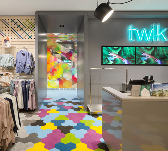
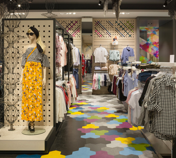
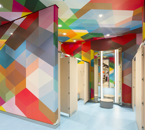
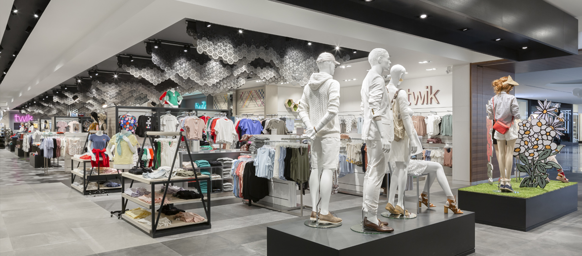
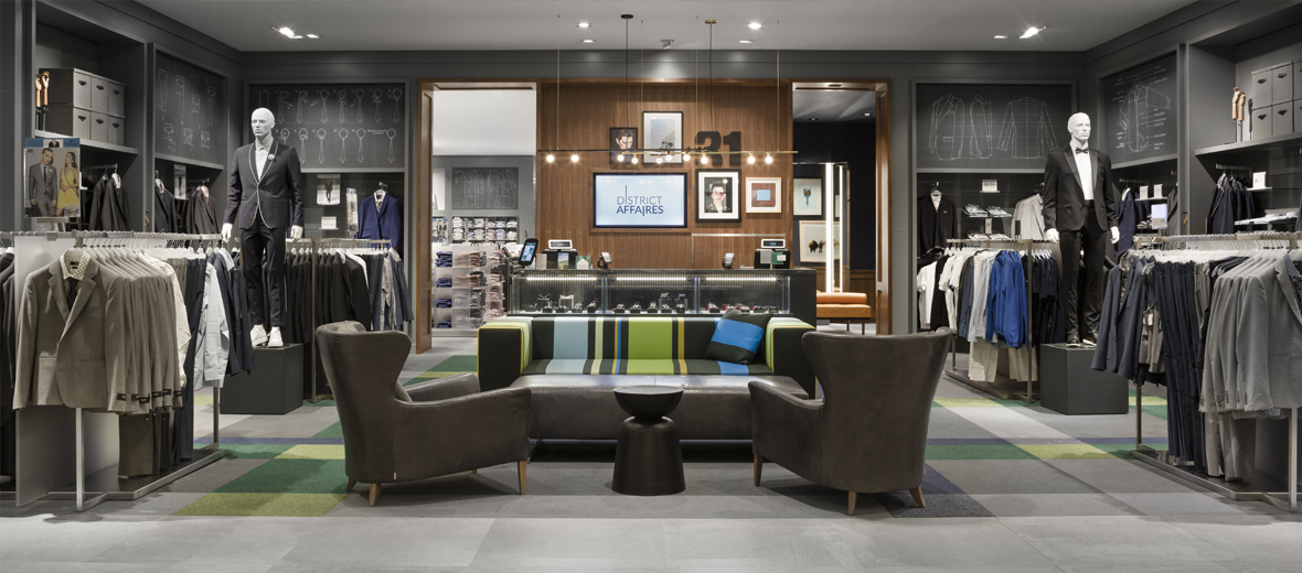
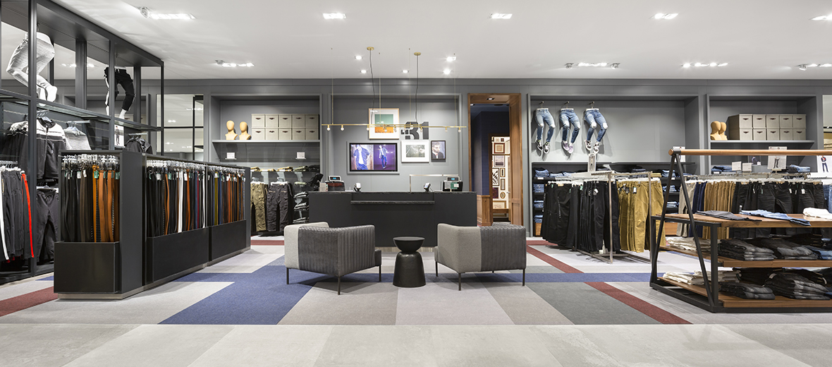
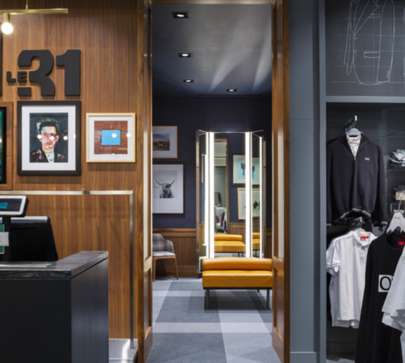
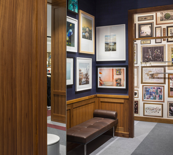
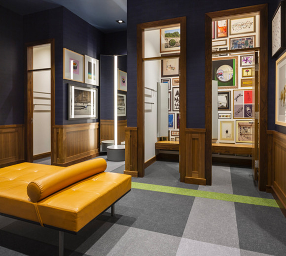
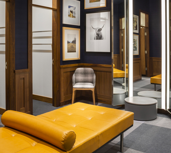
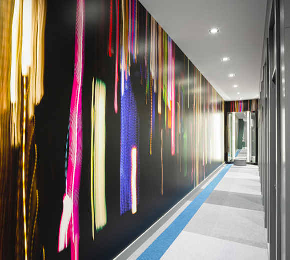
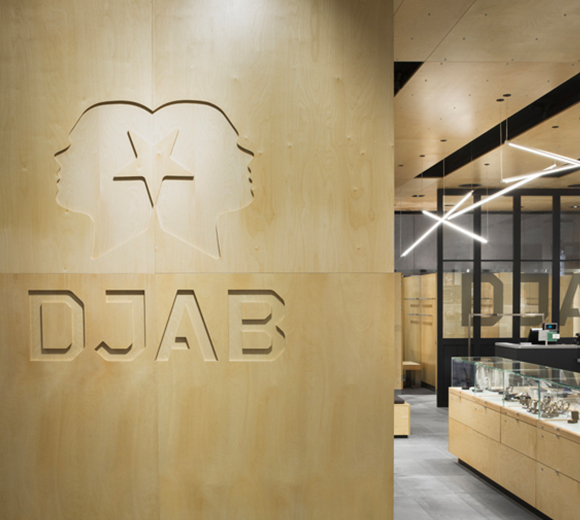
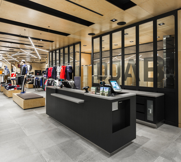
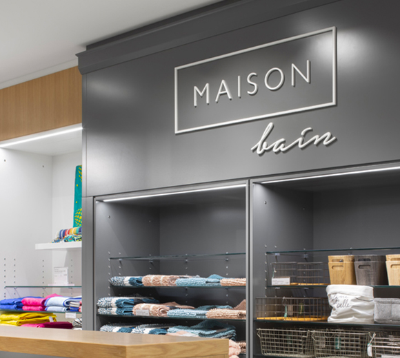
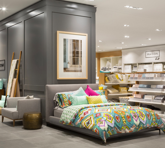
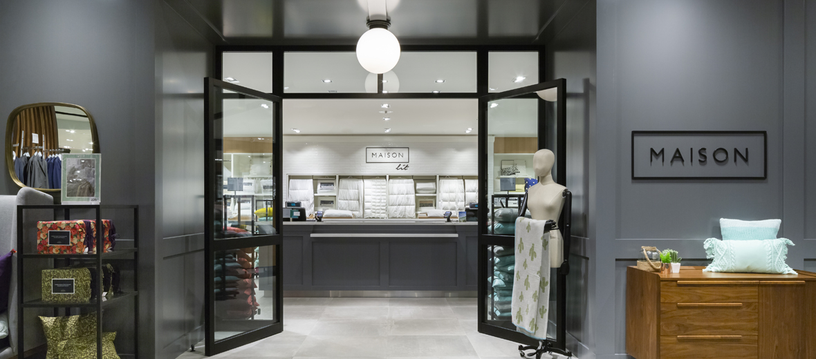
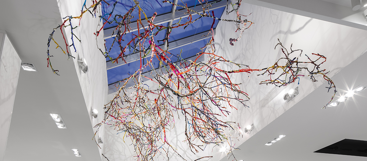
La Maison Simons Galeries de la Capitale project was developed to reflect Simons’ environmental policy and core values; it was therefore imperative for the design to draw its inspiration for the same source. Implanted into an existing building, it was necessary to use the envelope as backdrop and let the design mould itself to it. The brick was preserved and the integration of a weaving of colourful steel elements, like a unique tartan, gave a nod to the Scottish clans and to the origins of the Simons family. The superimposition of the elements brings depth and relief, and generates interesting moving shadows on the facade. The interior design, developed in the same spirit, incorporates custom-made craft elements, such as an art piece made of recycled clothing that represents an inverted forest. The various departments are distinguished by the use of unique materials that each create various universes that are in turns dynamic and vibrant, intimate and elegant, chic and modern, the result forming an original and coherent shopping experience.
Net Zero Carbon footprint: First in Canada in its category
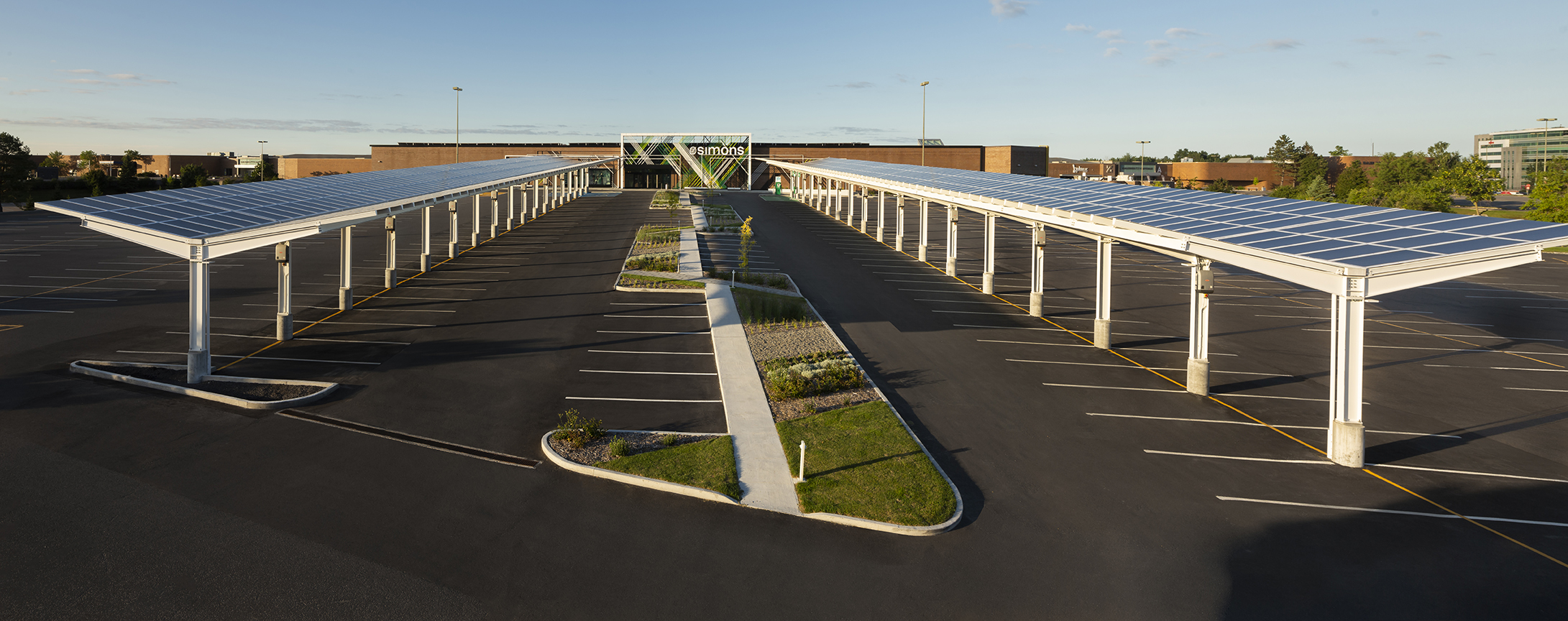
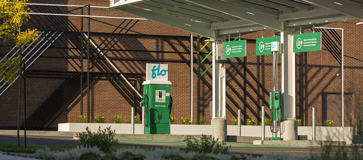
The first store in a series to have a zero carbon footprint and the first in Canada to achieve it, the environmental objective of this project reflects Simons’ values, whom is working to present its green philosophy, both in the physical environment and in its operational choices. In this sense, the store stands out in two ways: by its consumption reduction and by its energy production. In order to achieve the set goals, the planning of traditional systems was revised, resulting in calculated choices such as the use of geothermal wells and of LED technology for lighting. Then, by the integration of double-sided solar panels to the roof of the building and to the parking carports, to produce the required energy for its needs, and thus giving an eco-responsible signature to the project.
Integrated Branding
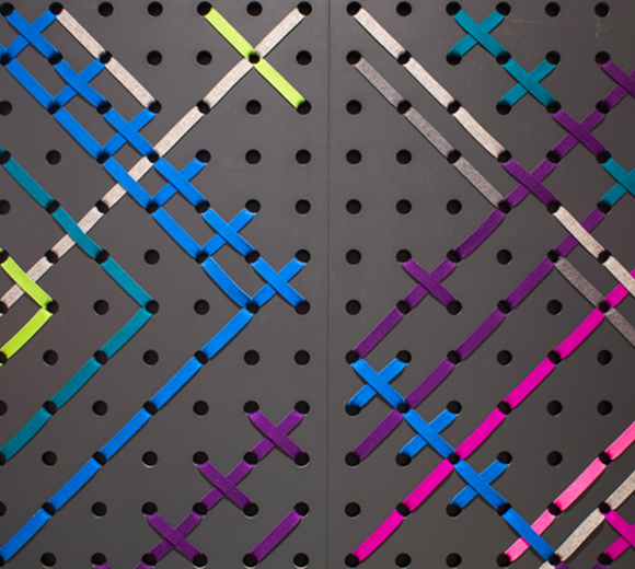
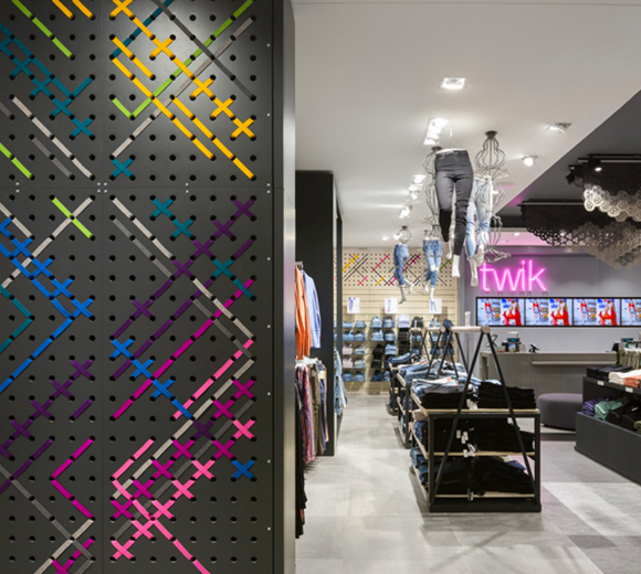
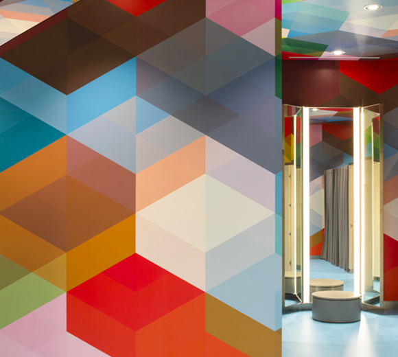
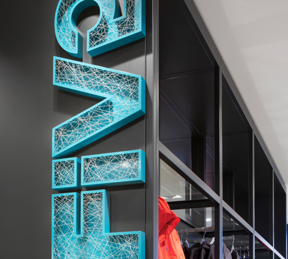
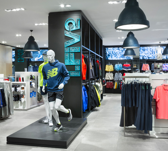
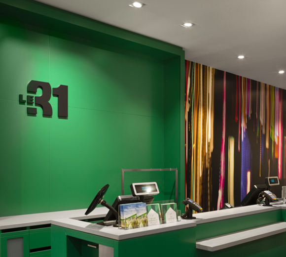
The concept developed for the store is an expression of the brand itself and its values, in both the architectural and the interior design concepts. Through the use of a range of green shades, the concept not only refers to the corporate image of the company, but also nods to nature and the multitude of hues of foliage, thus relating to the environmental values of the project. Each of the departments, linked to the various company brands, expresses itself through the design elements that inhabit it. Thus, the essence of each brand is deployed through materials, colors, textures and the choice of graphic elements to express dynamism, movement, elegance and refinement. In addition, some integrated details enrich the design and reference to the fashion industry such as the giant embroidery used as a display background. In the exterior concept, in addition to the integration of environmental technologies, the brand is integrated through the materiality of the steel elements that form the weaving, referring to the textile and clothing industry.
