Alt+ Dix30
Brossard
2018
168
8
Alt +, a new banner of Groupe Germain, a new concept.
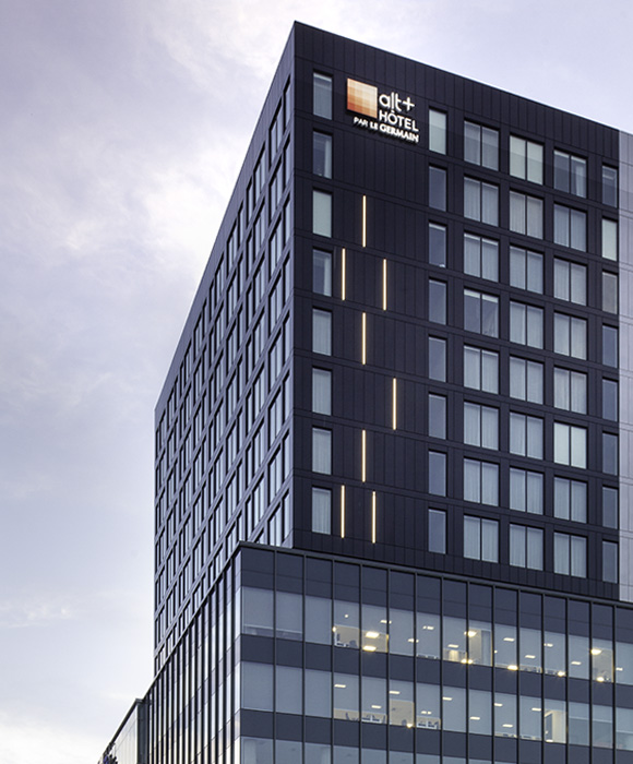
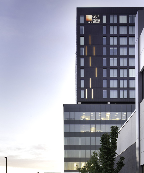
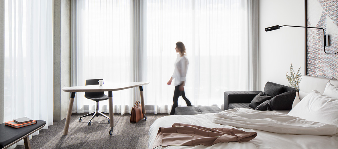
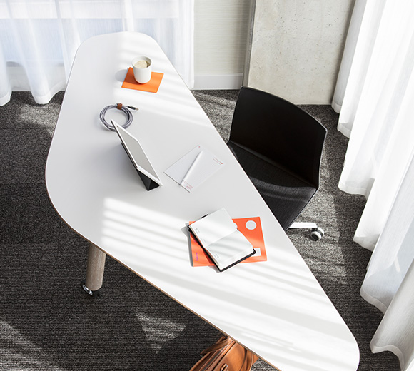
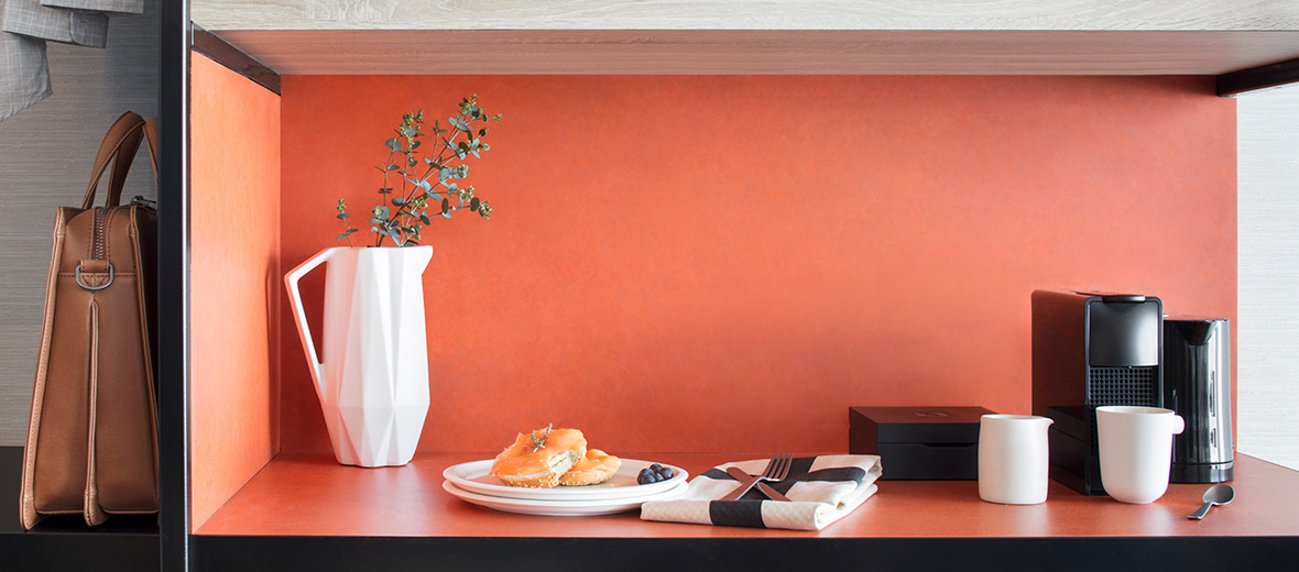
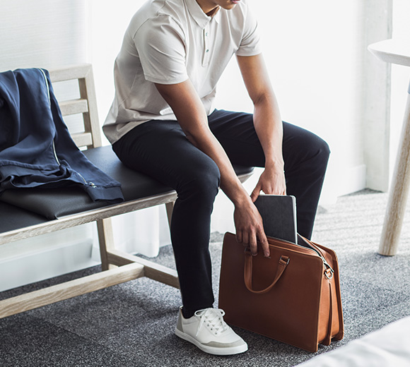
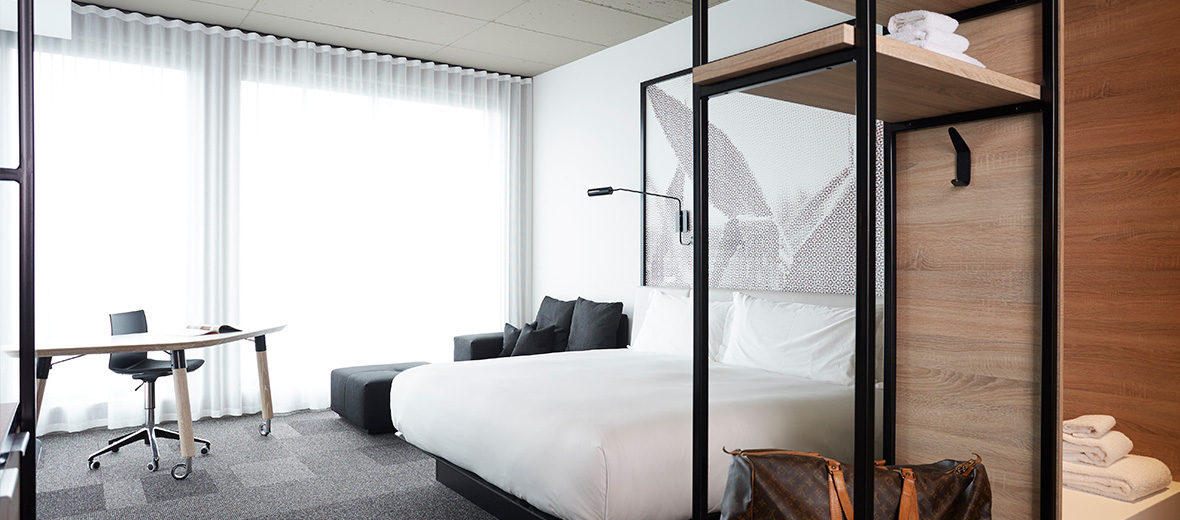
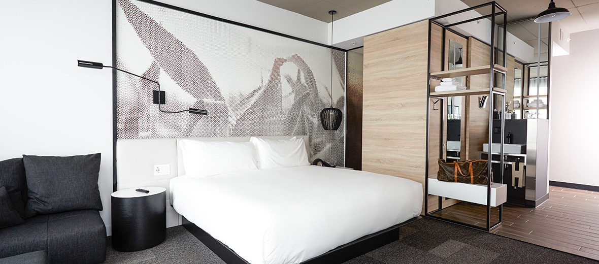
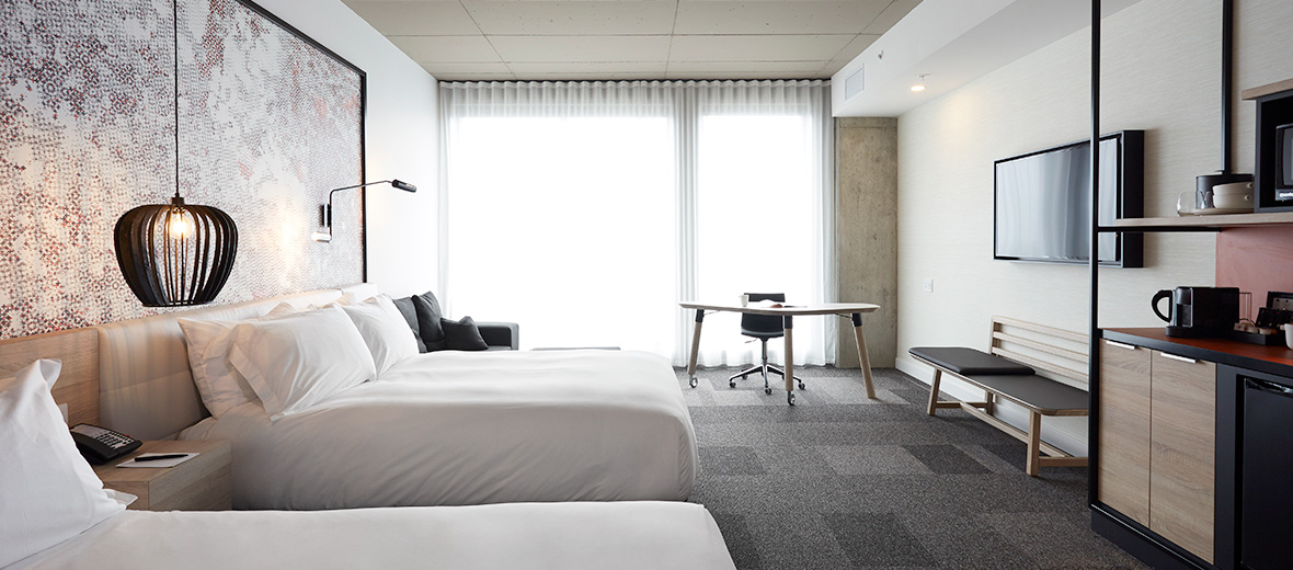
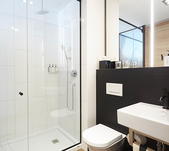
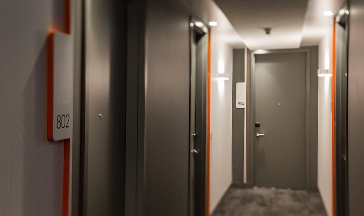
The first Alt+ hotel, a new banner of Groupe Germain Hotels, was opened last April in Brossard. The new banner, which can be placed mid-way between the Alt and Le Germain hotels, distinguishes itself by its layout and the equipment of its guestrooms aimed at, amongst others, a business clientele and visitors that plan for longer stays. The firm has collaborated once again to the architectural and interior design of the building.
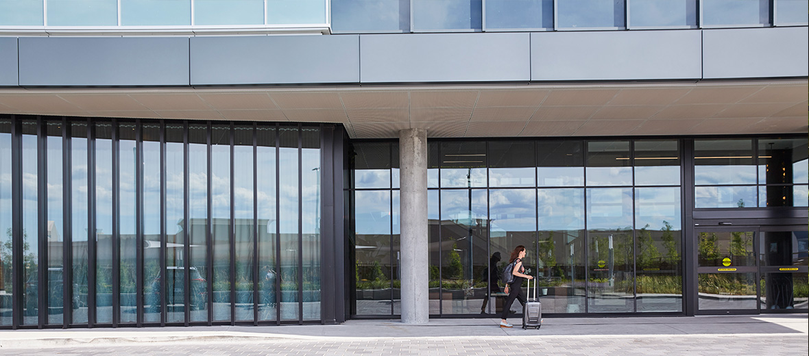
The new 168-guestroom hotel, which is housed on the upper eight floors of the building, is the result of two years of work by our firm, in collaboration with the Groupe Germain. The building, with its square tower, presents an exterior facing on the ground floor that, by the rhythm of its vertical mullions, creates an interesting optical effect giving the impression that the façade gradually opens to passers-by. In addition, the design of the oversized marquee points to the entrance of the building.
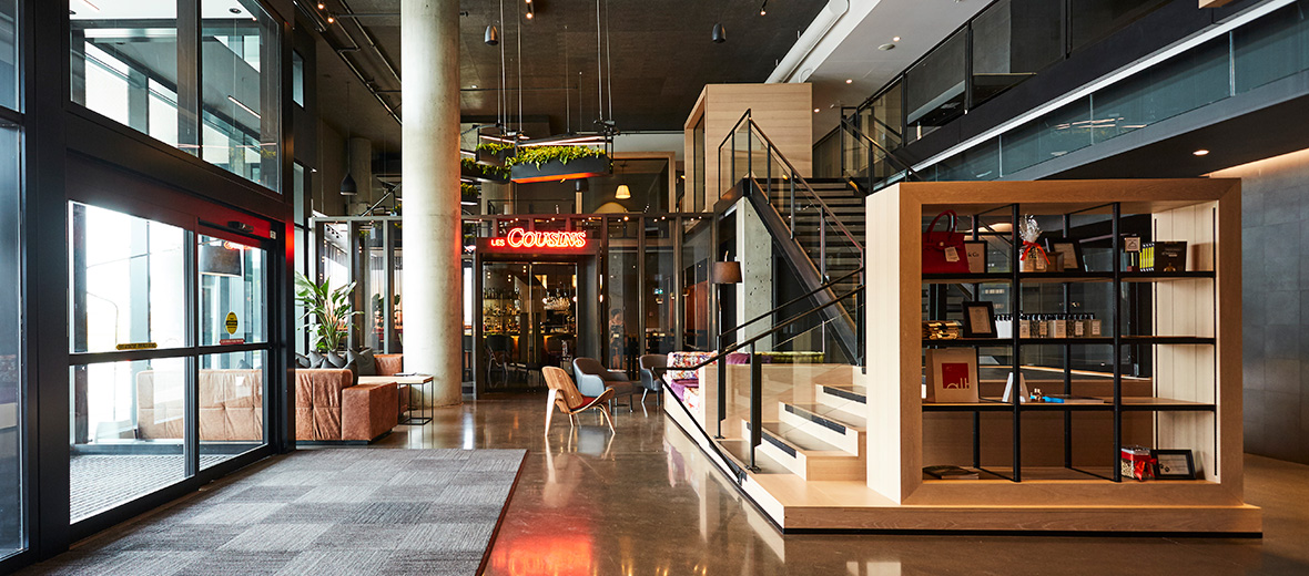
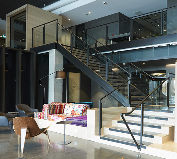
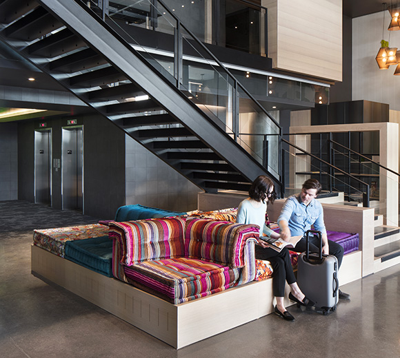
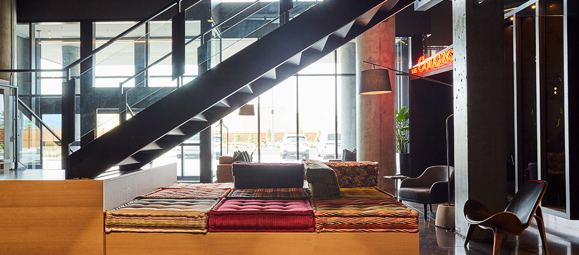
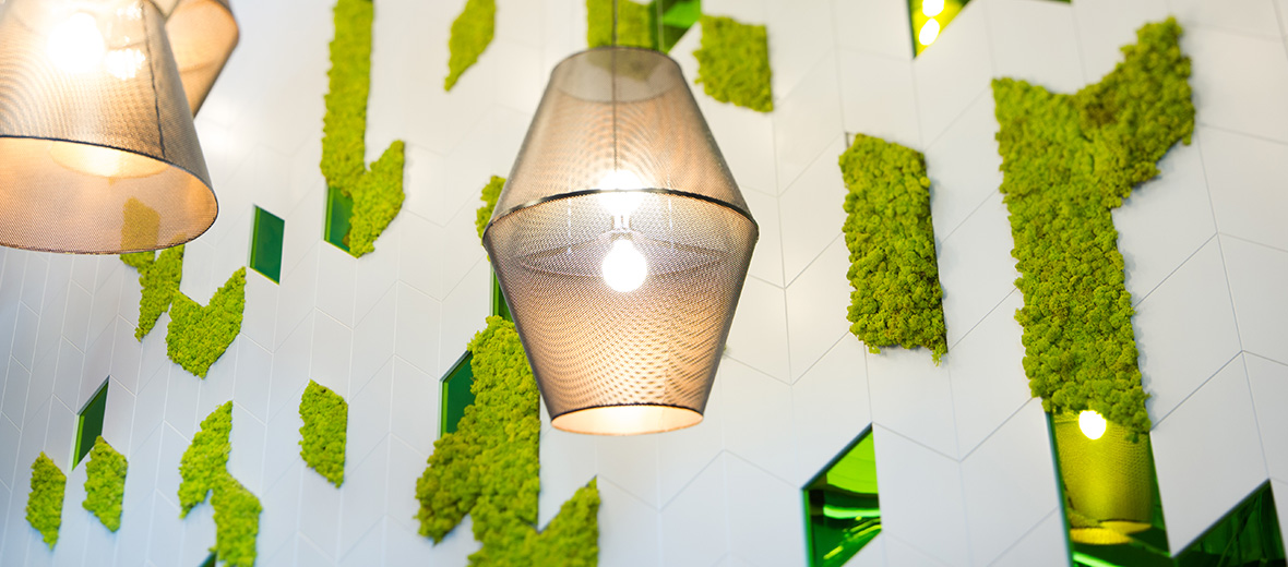
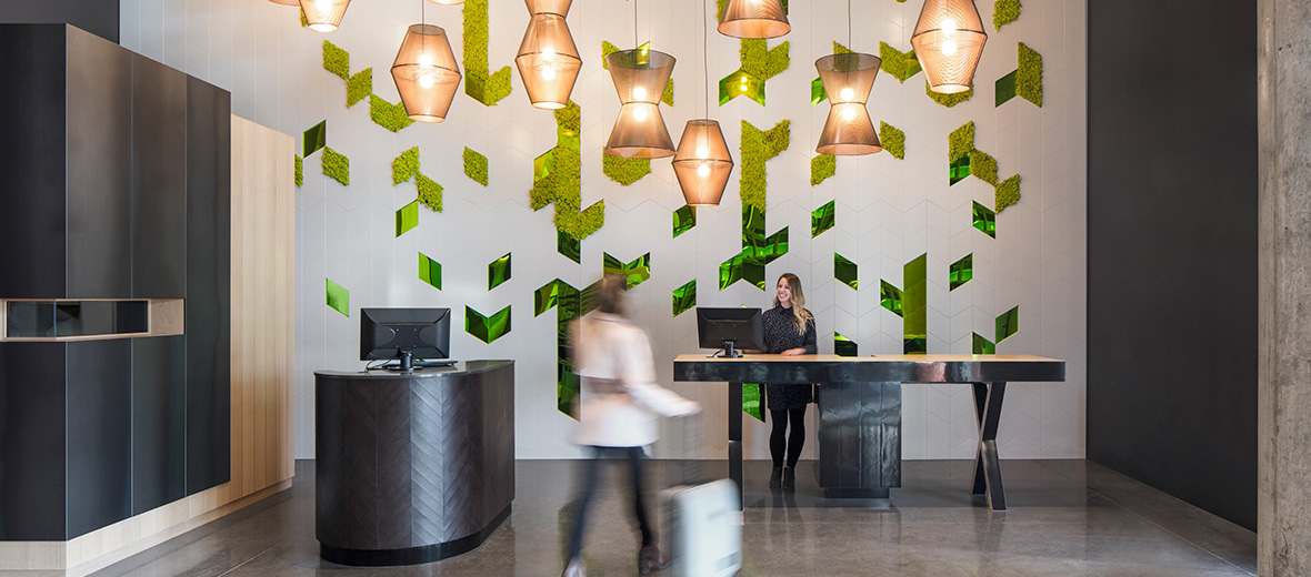
The interior and graphic design concepts are inspired by the surrounding Montérégie region, by open spaces, nature and agricultural fields. These themes are transposed into the built environment in various ways. For example, the layout of the entrance hall is open and uncluttered, the reception desk is replaced by more user-friendly furniture and the presence of elements such as the green wall, the flowery patterns of different coverings for the seating and the material used for the made-to-measure lamps are all reference to nature, and all help make the hall a space designed in the image of the surrounding region.
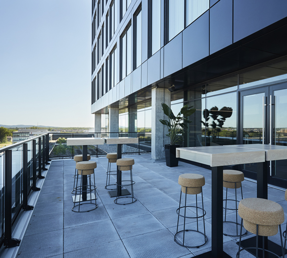
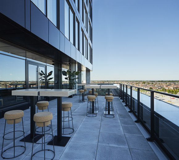
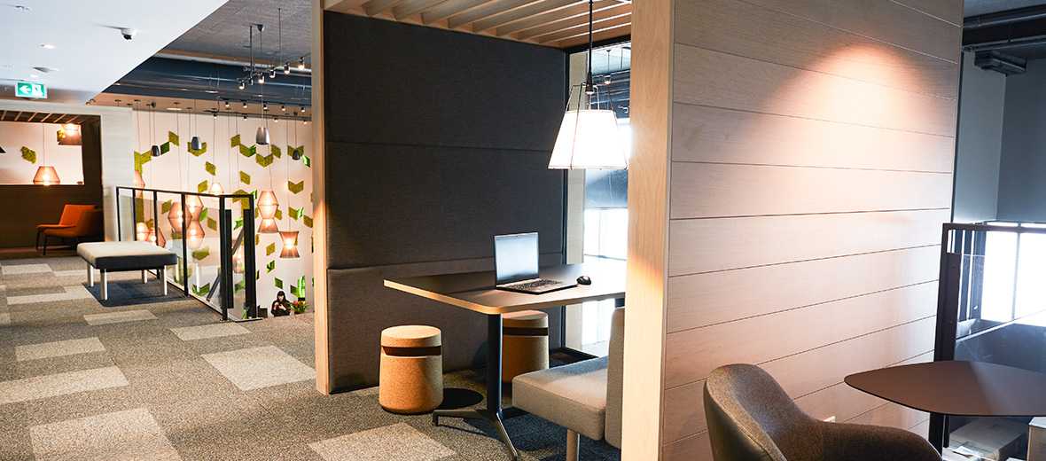
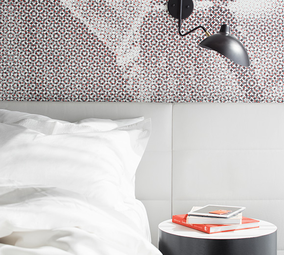
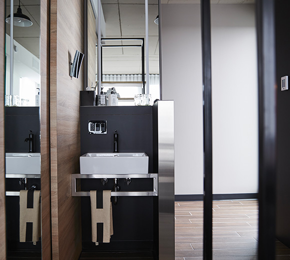
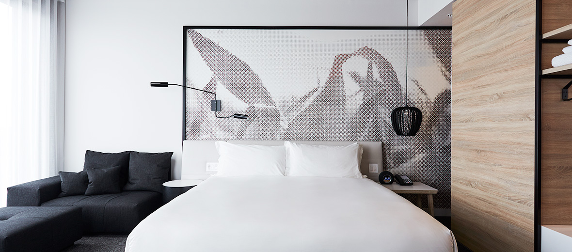
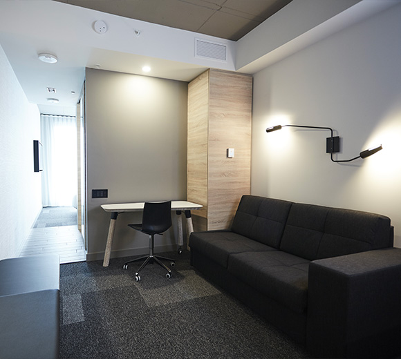
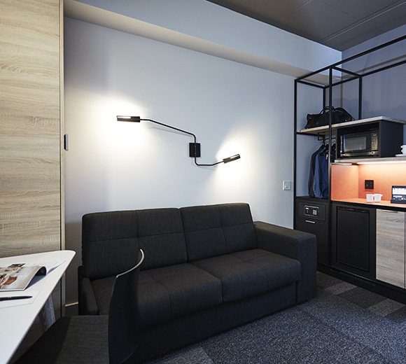
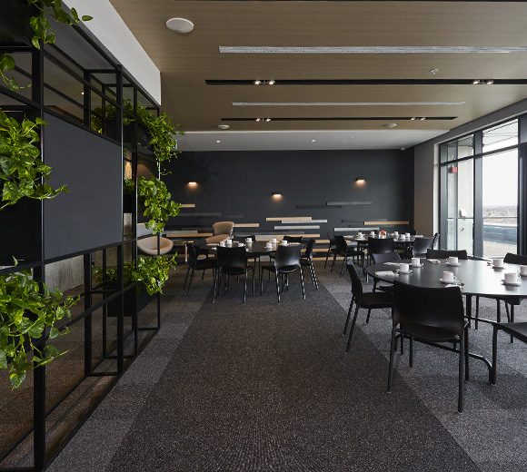
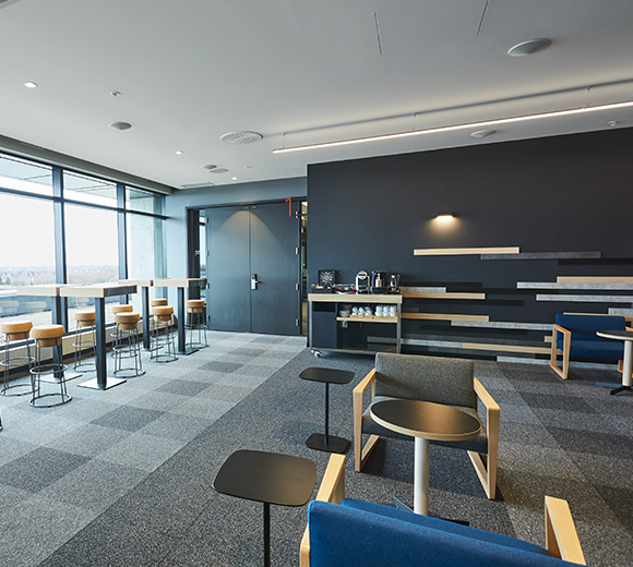
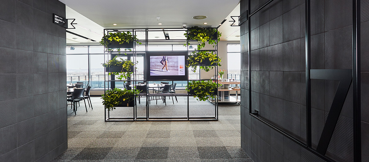
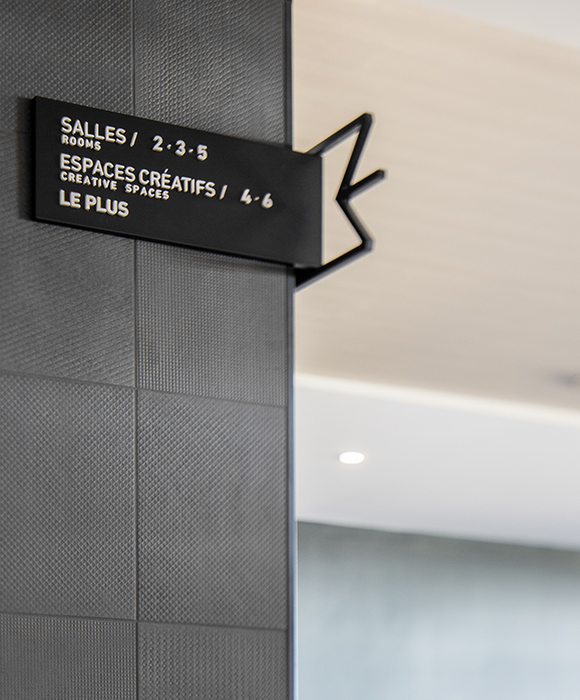
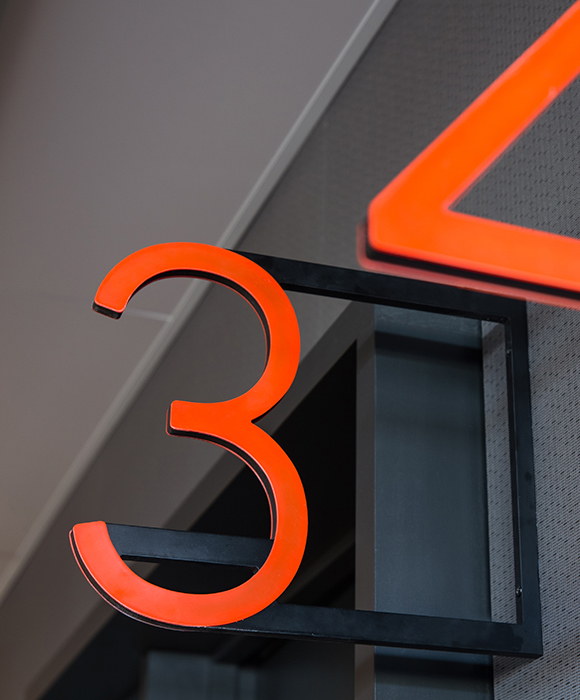
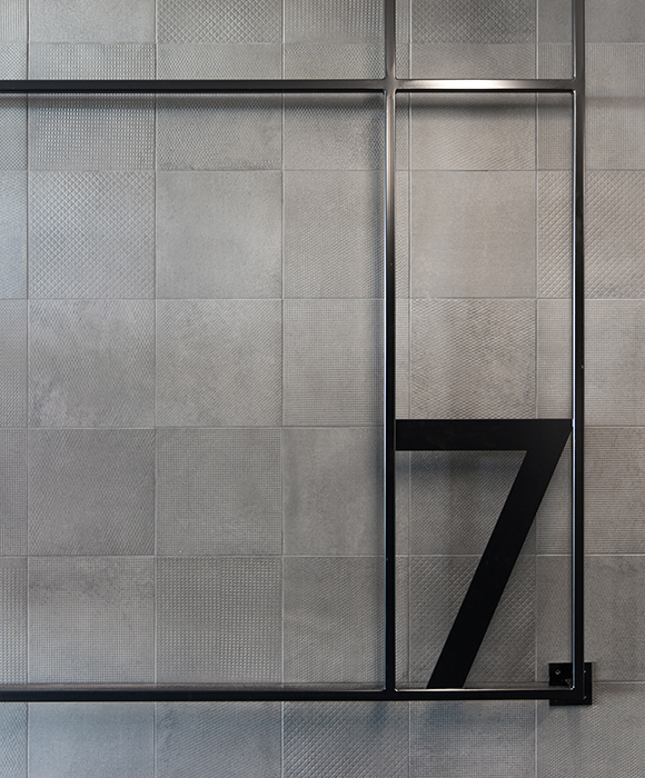
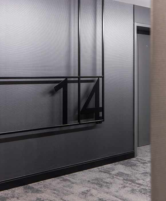
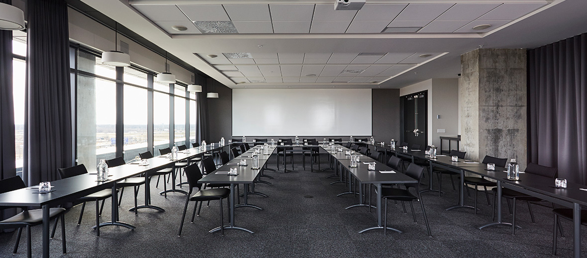
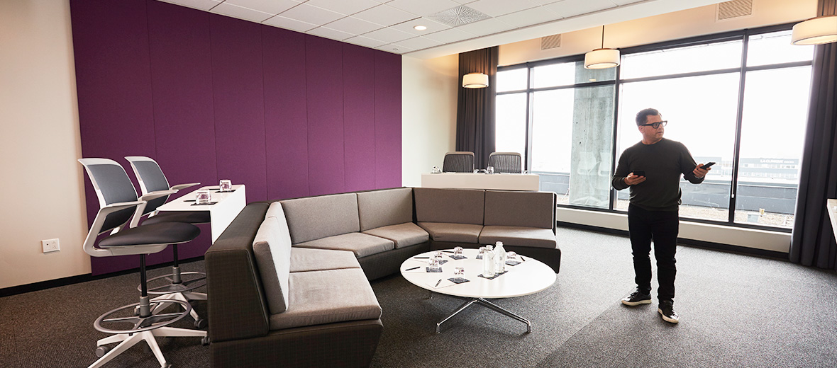
On the mezzanine in the lobby, small partitioned spaces – perched like bird houses – are scattered in the space and allow for informal meetings, an alternative to the more formal meeting rooms located on the 7th floor. The latter all benefit from natural light and offer breathtaking views of the region. In the bedrooms, custom designed furniture was developed in order to maximize space while keeping the layout light and airy. The graphic design was developed in line with the brand and uses for the grid of the murals, and in reference to the brand, the ‘plus’ sign present in the identity of the hotel.
Check out the Alt+ Dix30 Hotel website.
Consult the other LEMAYMICHAUD’s hotel projects.


